As calligraphers, we’re often so eager to put the pen to the page that we skip over considering our calligraphy layout. A book I made recently is a prime example of this. If you’ve been practicing calligraphy for a while and are starting to create final calligraphy pieces with longer text, read along for tips on how to strengthen your compositions — and to see how I could have planned my book better!

Jump To:
My References & Recommended Layout Books
- Mastering Layout by Mike Stevens
- The Non-Designer’s Design Book by Robin Williams
- Writing & Lettering & Illuminating by Edward Johnston
Calligraphy Layout Video on YouTube
(article continues below)
Terms Used in this Article
When I was planning a presentation on this topic for the Calligraphic Society of Arizona, I realized I was using the terms, “layout” and “composition” interchangeably. I checked out these words on Dictionary.com and here’s what I found:
- Composition: the act of combining parts or elements to form a whole
- Layout: an arrangement or a plan
Think of composition as choosing an outfit, and layout as trying it on to make sure it fits you properly.
Beautiful Calligraphy, Poor Layout: Why Drafting Calligraphy Matters
A quality layout comforts the mind and guides the eye of the viewer, inviting them to spend time with your work and look through it for longer. It will have them think about the message you are sending.
A lackluster, or non-existent layout will make the viewer feel uneasy, at best. At their worst, these works can also be confusing or difficult to understand.

For example, on first reading, the text at the left says, “I was shower thinking . . .”. This of course prompts the question, “What is ‘shower-thinking'”??
Only after finishing the short phrase does the reader notice the clarifying words hiding at the left, “in the”.
It then needs to be re-read as, “I was in the shower thinking . . .”. While charming for bathroom wall decor, the extra effort needed to comprehend it is a little annoying. And that’s not how we want our viewer to feel.
The clearer and easier to digest the text, the better!
Developing a finished calligraphic art piece can be an process involving multiple sheets and types of paper. The more acquainted you can get with the text and your calligraphy, the better results you will have.
How to Develop a Composition
The following tools are what i use to put a piece together. Generally, I always start with the text, but you don’t necessarily have to do these in a specific order. That said, most times, each of the following should be considered for each project, even if only briefly.

One of the best tips I’ve ever heard came from Tamara Stoneburner at IAMPETH in 2024: “Read the text out loud”, which I believe she learned from the late and great Sheila Waters. Reading the text out loud will help you to listen for natural pauses and emphasis. Tamara advises to then arrange the text in a way that someone would naturally read it, making the piece more inviting and enjoyable.
Sketch the Text in Pencil First
Use your regular handwriting and get acquainted with the text. Think of this as a creative warm-up, like working clay before you’re really able to shape it.

Tamara Stoneburner shared this helpful hint as well: don’t be married to your first draft! Try arranging the text in different ways. Often, the ideas get better as we go. Remember to read the text out loud to hear the natural pauses and words that have gravity.
Try this technique for arranging text that I learned from Amity Parks for drafting a short text using a pencil and your regular handwriting. Write your quote out in 1 line. Then write it out again, breaking it up mathematically into 4 words to a line, then 3 words to a line, and finally 2 words per line. Choose your favorite. Next, we’ll adjust the text to add emphasis.
How to Create Emphasis in your Composition
Each of the following is a tool you can use to create an atmosphere around the text you chose to make into a final piece. They’re listed in the order that I use when developing compositions, but you can work with them in an order that you’re comfortable with.

Ask yourself:
What is the most important information or sentiment in the text you’re working with? Are you making a marketing sign for a business? Is this a memorial poem? Is there a certain word that inspired you to pen this text? This is kind like looking at a photo and trying to decide what the subject of the photo is. When the subject is more obvious, it’s more fun for me to look at the surrounding items in the photo. I like to see how the photographer chose to frame the subject and make it interesting. The same can be done with text.
What do you want the reader to focus on? Is this an emotional piece? A practical piece? Are you giving directions? Is it a family tree? Are you trying to share and convey an emotion? Whatever you choose, let this be a guide for the next decisions. Again, the clearer your message, the better.
Now that you have an idea of the important words in your excerpt, here are some ideas for capturing attention:
- Make important words larger. This can be one to two words that you want to stand out against the rest of the text. This will catch the viewer’s curiosity from far away. You can make just one word larger, or mix sizes to create interest.
- Use a different calligraphy script to contrast your important word against the rest of the text. Just make sure it’s legible.
- You could write the text you’re highlighting in a different color.
- Consider decorative elements such as a versal letter, a foliage illustration, a ribbon illustration, a border, or a ruled line to create drama and interest in your composition.
Additional Design Tools to Consider
Choose calligraphy and spacing to reflect the underlying emotion of the text. A passage about a river might be nice with lots of space between the lines of text, maybe a subtle wave to the baseline. On the other hand, texts about anxiety or fear may be best presented with compressed, erratic calligraphy. Note that you can write the same hand in different sizes and weights, you don’t have to mix scripts at all.
Get out your color wheel. Use warm colors for a rush of energy, cool colors to create calm
The Surface You Will Write On. Consider what surface you will be writing or lettering on. This will contribute to how the viewer interacts with the text. On a practical level, you want to make sure your writing tools will cooperate with the surface. For example, it’s challenging to write with a pointed flexible calligraphy nib on very rough paper.
Test, Test, Test
Once you have an arrangement you like, practice the text with the final tools you plan to use. I get a little carried away and try a handful of different nibs. My advice to you, and to my future self, is to write down what nib you used for each test.
This is the phase where I rule the guidelines that I’ll use for the final piece. Use this practice to iron out any unforeseen issues in your draft. If possible, test your nib and ink with your final paper, just to make sure the ink doesn’t feather.
Can write on layout bond or tracing paper to make moveable pieces for experimenting. If you need to trace a letter or design element onto another page, make sure you add some registration marks. These are marks that show the vertical and horizontal guidelines in relation to the letter or illustration. Registration marks help you to align your lettering as accurately as possible.
Write down what nib, ink, and script you decided on. That way, you won’t have to try to remember it later. This is also a good time to test your paper, ink, and nib together just to be sure they cooperate.
Hold your draft up to a mirror or look at it through the camera on your phone. This will show you empty spaces or flaws that you wouldn’t otherwise see.
Crafting a Layout for Your Calligraphy

Layout gives you the ability to guide the viewer around your composition. If you remember from above, layout is defined as “an arrangement or plan”. Your composition says, “this text is important”. Layout says, “here’s how to look at it”.
As intentional as material choices and calligraphy strokes are, so should the negative space be around and throughout your work. We write the text itself within certain bounds; even flourishes are governed by stylistic and geometric proportions. On a slightly larger scale, calligraphy layout is an invisible structure you create to support the quality of your intricate work.
Think of the empty space on a page as a cushion. It pads the area around your composition. Think of layout as entertaining a guest in your home. It’s the difference between having them sit on a concrete floor versus inviting them to relax in a recliner. I know which scenario I’d rather spend more time in. And remember, you’re inviting someone to spend time with your work, and your work deserves to be enjoyed.
The Final Size of the Piece. Whether your calligraphy is for a client or not, take a moment to define and visualize how you will present the final piece. You may have to adjust this as your design progresses, but it’s better to define parameters now than try to contain calligraphy later. Your layout is going to depend on the amount of text you have to write and, of course, how you decide to present it. Some examples include greeting cards, a sketchbook, a wall sign, or a book inscription. The final size will play a role in your decisions for composing the text.
There are 2 main elements to layout: optical center and margins.
Why Optical Center Matters in Your Calligraphy Layout
The optical center refers to what the mind perceives as the visual center of a shape from top to bottom. This is SO important because we’re planning our work for people, not for measuring equipment.
If you write your text at mathematical center, it will look “off”. Specifically, it will look like it’s too close to the bottom of the page. I’ll talk a little bit more about this in the section on Margins.
How to Calculate Optical Center (or Approximate it)
I usually work on pieces that have the size determined beforehand, planning the calligraphy within those parameters. I sometimes use optical center to place text or design elements. You can work with this tool even if your calligraphy is already complete.
Optical center is slightly above the true center of the page. We measure it using the length of the page from top to bottom.
- Measure the vertical height of your page
- Multiply this by 46% (or 0.46).
- I round this number to the nearest quarter or half inch
- Measure this amount downward from the top edge of your surface
For example, if your final page is 12″ tall, you’d multiply 12×0.46. I get 5.52. For that, I would round to 5.5″. From the top of the page, optical center would be at 6.5″.
Don’t have the tools or time for percentages? Optical center is “just above” mathematical center.
Optical center won’t always be relevant to your work, but it will make a difference if you’re writing a single line of text. Use your calligraphy layout to plan the most visually appealing placement.


I’d like to add that I understand intentional artist choices, especially when it comes to pushing boundaries or dissolving them entirely. Perhaps in your career, as in mine, there are times for that, and there are occasions that call for gracefully navigating those same boundaries. Both have merit, and both are important skill sets to cultivate.
Why Margins are Essential to your Calligraphy Layout
Dictionary.com defines margin as “1. the space around the printed or written matter on a page; 2. an amount allowed or available beyond what is actually necessary.”
Margins collaborate with optical center to help your mind feel supported as it looks at the work. When we perceive that the text is too close to the edge, or too close to the bottom, it’s unsettling to our nervous system. We sense that the text is about to fall off the page. We don’t feel secure, and we want to look away.
Think of this the next time you’re scrolling through photos of calligraphy. Notice which ones you skip past. Go back to them and try to pinpoint what repelled you. What would you do differently? Just food for thought, not an invitation for unsolicited critique comments!
Adequate margins make us feel guided and cared for. They provide energetic support to the text. A margin is what encourages the eye to explore the composition further after it’s read the text. Look at the difference it makes in the wedding signs below:


The second sign is from April of 2021. I started by marking the margins. Then, I put the couple’s names at optical center. I created the rest of the text to fit into the negative space. I also varied the size of the text so the mind could read the information in order of significance. Visit this link to check out the rest of the signs I lettered for this event!
Margins have practical benefits as well. The additional space makes matting and framing the artwork a little easier. It also allows people to handle the piece without getting fingerprints on the calligraphy.
How to Calculate Margins
As a general rule, there should always be less blank space at the top of a piece than there is at the bottom. Of anything, let that be what you take from this article and implement. A simple way to achieve this ratio is to make the bottom margin twice the size of the top margin. If you’re leaving an inch at the top, leave 2 inches at the bottom.
I learned the following from Mike Stevens’ Mastering Layout. The top and side margins are equal, and 5% of the height of the page. To keep with our 12″ page from the previous example, multiply 12x.05. That gives me .6″, which I would round to .5″ for the top margin, as well as the side margins.
To get the bottom margin, I double the measurement I’m using for the top margin. In this example, the bottom margin would be an inch.
Enclosing your calligraphy with margins gives the viewer’s mind less to think about and figure out. This way, they can focus on reading and reacting to your beautiful script.
How to Draft the Calligraphy for Your Layout

Start with a draft of the text you’ll be working with first. Write the calligraphy at-scale or at-size (more on scaling down your artwork below). This lets you decide on and practice the script, play with ligatures and flourishes, and decide on the interlinear spacing. Playing around with ideas like this gives you the confidence to arrange the calligraphy and decide on stylistic and decorative elements; it takes the pressure off and lowers the stakes.
For longer pieces of text, write a few sample lines of it in the script and size (x-height) you want to use. Write them at the length of the lines you think you’re going to use for the final piece. The average number of words per line will give you the amount of lines you’ll need for the entire text. This will help you plan for the size of the page or area you are working on. With this knowledge, you can then adjust the size or layout of the text to fit properly within the margins.
Scaling Down Size for a Sketch
Draw scaled-down versions of the planned final piece in pencil. Use wavy lines and boxes to represent your calligraphy and blocks of text. Play with arranging the text and try out new skills.
These sketches, often called “thumbnails”, should be loose and basic, not detailed. They serve to set the hand and ideas in motion. All the while, you’ll have an idea of the big picture of the final piece. I typically plot the edges of the sketch and the margins in pen so they stay as I erase over and over.


To scale down the final piece to a brainstorming size, I try to find a common number to divide each side by. The bar sign above measured 18″ wide by 30″ tall, so I divided each side by 6. This gave me a smaller drawing of 3″ wide by 6″ tall. Try to make the sketch at a size you can still see clearly and add notes. I love to draft on 1/8″ graph paper (not an affiliate link) so it’s easy to add specific measurements later.
Integrating These Calligraphy Layout Tips
Start paying attention to what you enjoy about other calligraphy artists’ work. Try to name it. Notice how the artist uses the tools we talked about above.
Conversely, notice when you instinctively scroll past a piece you see. Go back and try to figure out what made you avoid it. Take some time to figure out how you would make it more pleasing to you.
Also, study historical calligraphic pieces. Notice how they create emphasis and add decorative elements to their work. Then, consider the way you want to visually tell a story with your calligraphy layout.
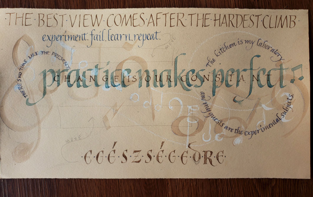
5. My Mistake(s?!)
I almost forgot to share what went wrong when I wrote the calligraphy in my handmade book!
I was so excited to start penning this beautiful text, especially since I took my time to rule up circular lines outside of the bursts. So I didn’t sketch the calligraphy layout. I practiced it, and carefully chose a size for it, but I wish I’d used tracing paper over the painting to plan the placement better.
I did all the calligraphy before I folded the book. It’s better to write with a page on a flat surface rather than fight with the wrist bumping up against the edge of the book. I ruled the lines so that the calligraphy would swirl around the bursts I painted. But between the first and second pages, I didn’t leave a margin.


Before I started, I drew in the top and bottom margins just to be sure I’d be careful of those. Luckily I caught the missing margins at the folds early enough. But not before I had already made this mistake. I’ve learned my lesson, but that doesn’t mean I won’t make the mistake again.
And this way, we can all learn together. Once I finish this book, I’ll post a video here showing the binding and all of the pages. Thanks for reading!
first published May 2021, updated October 2024
Since you have finished the book, have you made the video you mentioned above?
I haven’t yet because I haven’t added the covers! I keep getting sidetracked by other projects!