My clients requested a replica of an illuminated certificate to present to their manager on her 10 year anniversary. The original was presented to my client’s great-grandfather after WWII. It’s been preserved in the family and my client sent me first-hand photos of it. The wording of both certificates were like letters from devoted friends to someone they respect.
From what I could tell, the original certificate was on vellum and had 2 intricately illustrated letters with gold leaf. The calligraphy was an interesting combination of styles of Engrosser’s Text, a script I’ve never really delved into. As it goes, The Gentle Penman happened to advertise an online 4-part Engrosser’s Text course with Rick Paulus. The course helped me analyze and reproduce the original calligraphy, and I learned lots of other goodies along the way!
Since my clients needed to sign the certificate, I offered to add light pencil lines to keep the signatures straight and evenly spaced. The remote team would then ship the certificate back and forth for signatures before presenting it to their manager.

I can tell how much I loved working on this by the amount of photos I took and the way I prioritized writing about the process. Of course, I want to share this knowledge with other people, but the need to write about it shows me just how much I enjoyed it!
Read on to see what steps I took to recreate this impressive work!

Choosing Materials
Vellum was the first choice as a writing surface for the illuminated certificate, but there wasn’t enough time to acquire it and do the calligraphy.
Instead, we agreed on Arches Hot Pressed Watercolor paper in a natural white shade instead. Gold leaf needs a smooth surface to adhere to because it will show any unevenness underneath it, so hot pressed it best.
I also worked with gouache, which is a more opaque form of watercolor that’s really nice for layering, After all of our communication, my client and I settled on silver leaf for the numeral and gold leaf for the rest of the illuminated letters.

Designing in Reverse
Say it with me: “The drafting always takes the longest.” And that’s where most of the work is. Though I had the dimensions of the final page, 13.5″ wide and 19″ tall, it took some time to reverse engineer the size of the illustrated capitals. Through the process, my client let me know that the width of the design was 9″, which was so helpful in developing the blocks of text.

Similar to the original certificate, this version started with a greeting: “Dear Jackie”. I drew the outlines of the letters D and J that would later be filled with gold.
Using a few techniques I learned from Risa Gettler through the Texas Lettering Arts Council earlier this year, I replicated the eye-catching letters A, T and E.
I scanned all of my drawings for the client to approve.
Choosing a Pen
When working with certificates, words that are more important are larger. With this certificate, there were a few different sizes of text, so I chose 5 or 6 different sizes of Mitchell Roundhand nibs to experiment with. As usual, I labelled the different samples with the nib size I used for reference.
Read my article, “What is a Calligraphy Nib?” for more about what they are and how they work.
I wrote many drafts of the main paragraph of the text at full size. This got me into the rhythm of writing Engrosser’s Text. Once I had a feel for how I was writing the calligraphy, I used the drafts to judge the size and spacing of the text.


Once I decided which nibs to use, I marked my different pen modules onto the edges of an index card. I wrote the appropriate nib size next to each module.
This sped up the time it takes to rule up lines for practice, and served as a reference tool later on in the project!
Developing Calligraphy Layout
We needed all the elements of this design to fit together in a pleasing and practical way. I created a Photoshop document at half of the size of the final certificate dimensions. Then, I added scans of the sample calligraphy and decorative letters, each on its own layer. I scaled each element down to fit within the design. This document allowed me to quickly resize and rearrange text and decorative elements according to my client’s notes.
Once the client approved the final design, I added a vertical center line and a horizontal center line to the Photoshop file. These served as registration marks, ensuring I placed my watercolor paper accurately on top of the printout.
I then printed the Photoshop document at 200% scale so it was the full size. It took a few tries to get the printout correct, so I had an extra printout. I decided to use it as a visual reference and for notes as I worked.
To double-check my printout calligraphy against the nibs I planned to use, I held my index card with x-height measurements against each section of text on the printout. Then, I wrote the number of the nib next to each section on the reference printout. It was very important to use the correct size nib!
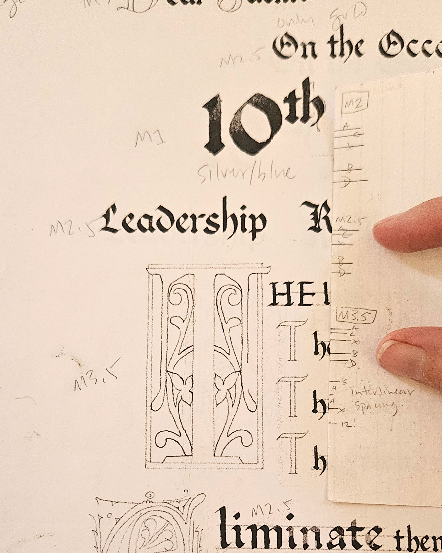
Adding Calligraphy Guidelines
Finally, even though I’d done so many drafts and had confidence with the calligraphy, and even though I was going to put the printout below my final page and use a lightpad to see the design, I added guidelines to each line of text on my printout.
I do this for a couple of reasons. It really helps to have the visual starting and stopping points as you’re writing. The letters in the printout are there to make sure I place the letters and words properly. I’m still responsible for the quality of the letterforms as I write them on the final page.
For more about this topic, view my article, “Tips for Guidelines and Why You Need Them“.
Finally . . Producing the Illuminated Certificate

To start, I cut the paper to size. I use a large, self-healing, gridded cutting mat and a framing ruler that has a rubber backing (left).
I protect the project surface with a clean sheet of paper before setting a large, flat, stone bookend on it as a paperweight. This ensures accurate measurement (barring human error — common in this studio) and no wiggles or slips during cuts.
Pro tip: locate the watermark in your paper before cutting so as not to include it in your project!
Before removing my paperweight, I lightly marked the vertical and horizontal centers at the edges of the watercolor paper. I used these marks as a reference point for placing the watercolor paper over my printout before taping it down.
When I printed my final layout, it took up 4 pages of copy paper. It so happened that when I assembled it, the printout was larger than the watercolor paper for my project. This was great, and here’s why! Since I was going to tape the watercolor page on top of the printed layout, I had plenty of space to arrange and tape the page down accurately. The larger printout also protected the corners of the watercolor paper, as they can sometimes get bent during the creative process.
Penciling in Lines
Now that I had my final page taped over my printed layout, I set up my tabletop easel and put my lightpad on top of it. I then taped the printed layout to the lightpad. This is the period of the project, you see, to avoid as many mishaps as possible!
Lately, my goal with finished pieces is to draw as few guidelines as possible onto a finished page so there are fewer lines to erase later. The exception with this piece were the hand-drawn letters to be gilded, or covered in gold, and the signature lines at the bottom of the page.
Something I learned years ago from Cheryl McLean, and later, Skyler Chubak, is to use a ruler or a drafting tool whenever you need a straight line. It increases accuracy and above all, saves time. So, I used a ruler to lightly pencil in the straight lines of the drawn letters. I then carefully traced the contours of the remaining curved parts of the letters.
Lastly, I ruled in the signature lines at the bottom of the page, as lightly as possible. My clients wanted to be able to erase the pencil lines after signing.
I also taped one of my practice pages over the ruled lines to protect them from smearing and to protect the page from any errant splashes of ink. I left this page taped in place until I took photos and packed this piece for shipping!

Layering on the Metal Leaf
Once all the pencil lines were in, I set the easel to the side and laid the lightpad and project flat on my desk. I left the lightpad because it’s smooth and I knew there were no errant fibers or oils on it. I laid it flat because it’s a more conducive angle for pointed pen and laying size, or adhesive for gold.
Next, I used waterproof ink and a pointed drawing nib to trace over most of the sections to be gilded. Next, I used Ormoline, a gold leaf adhesive, and a size 0 (super smalll!) paintbrush to fill the decorative letters. While this dried, I put the lightpad back onto the easel. I used a broad calligraphy nib dipped in the adhesive to write the capital letters in the second line of the piece, “On the Occasion of Your”.

After about 45 minutes, the Ormoline was dry and tacky to the touch. I laid several layers of gold over each of the letters.
It is always amazing and so satisfying to see the brilliance of gold in the shape of a letter, and I got excited to work on this certificate all over again!
Before I moved on from this step, I made sure to loosely tape paper over the gilded letters to protect them from scratches and dents as I worked.
Writing the Calligraphy
I mixed up some rich black gouache and got started with the calligraphy, using my notes on the additional printout as a reference. Again, I covered the parts of the page I wasn’t working on yet as a precaution.
This part of the project went fairly quickly, and I was able to relax into getting all the letters onto the page. My favorite part was seeing the richness of the pigment make these bold, beautiful letters.
Left: the gilded areas on the final page; switching on the lightpad to start adding the calligraphy
Completing the Illuminated Letters

Color was very simple in this piece, and I chose gouache for its opacity and layering qualities. I used varying tones of red and blue for each of the accented letters.
I’ll admit, this was the part of the project I was most apprehensive about! But this is why it’s so important to test out colors and let them dry before committing them to the final page.
In the photo at the left, you can see 3 separate pieces of paper covering the page around the area I was working on.
After the gouache dried, I carefully traced back around the gold with a Micron pen. I used gold gouache and silver gouache to add decorative lines and dots in the numeral and decorative A in the main heading (photos below).
Then, I used white gouache and a pointed calligraphy nib to add the decorative dots in the T and the E.
The last step with these letters was to “tool” the gold. Using a stylus with a small ball point, I lightly added decorative lines and divots into the surfaces of the gold letters. These markings catch the light and make the letters all the more luminous and decorative. Finally, I polished the gold with a soft cloth.

Adding Treatments to the Heading

To emphasize the heading, “10th Anniversary”, I started by drawing an outline around the text. I also added angled highlights to the text using a ruler and a triangle to keep them uniformly slanted.
After that was dry, I added a cast shadow beneath the letters using a light ink wash and a calligraphy nib.

Packing and Shipping
When shipping artwork, my top priority is protecting the artwork from bending and moisture. I made small paper corners and affixed them to a sturdy display board. I chose red paper for them since it’s the color I used the least in the design.
Then, I fit the artwork inside the corners so it would flat and in place during transport. The client could still easily remove it from the display board.
I attached protective tissue paper to the board as well to cover the certificate when it was not being signed or viewed.


Since people were going to sign the document, I included advice against using a fountain pen as the ink isn’t lightfast. I included a Micron PN pen, and suggested ballpoint pens for signing. To take the edge off of signing a page like that, I included a sample of Arches Hot Pressed watercolor paper for pen-testing.
I double-packed the illuminated certificate in plastic and placed it in a box with a protective barrier on the inside. To keep the artwork in place, I lightly packed brown paper at the front and back of the board.
Letting Go
My clients let me know that the certificate arrived safely, all the way from Tucson, Arizona to Maine. They said it looked fantastic! It so happened that most of the team was actually meeting in Texas after the certificate arrived, so they were able to sign it all at the same time. I hope that the recipient and all the people who appreciate them will enjoy the certificate for many years to come!
I brought my sample calligraphy and illuminated letters to a recent general meeting of the Calligraphic Society of Arizona in Tempe. One of my friends commented that it must be hard to see a piece like this go — I spent 75 to 100 hours working on it. And while it is hard to let it go, I also know that it will be framed, displayed, and treasured. That’s what the work is for, and that person will probably love it even more than I do.

Let us do the writing.
Save yourself some time and materials and let us handle your next DIY gift.
Click below to share details about your project idea and we’ll walk you through it!